Marketing Tools
Marketing Tools: Blocks
Blocks are content sections that can be inserted into the template and customized to build out your email. Many of the blocks are very flexible and can fit multiple different use cases and designs by adjusting their settings. You can also use several individual blocks together to build out a larger section with a consistent design.
All blocks have their own unique configuration options as well as standard options that all blocks share. The standard options are:
- Background Color
- Space Top
- Space Bottom
We have 14 standard blocks (in no specific order) which can be found in the "4Site Blocks" folder:
- 2 Buttons Block
- 3 Buttons Block
- Adjustable Image Block
- Button Block
- Divider Block
- Footer Block
- Header Logo With Optional Button
- Logo Header
- Rich Text
- Side-By-Side Image and Text Block
- Signature
- Social Media Icons Block
- Spacer
- Title Heading
Below we go into more detail on each block, its configuration options, and any best practices for using it.
Standard Blocks
These are our set of standard blocks. We're always iterating and building new blocks, so this list will continue to grow.
If you have a custom build, you may have additional blocks available to you. Please check with your 4Site contact for more information.
Adjustable Image Block
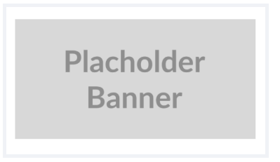
The Adjustable Image block contains an image with a hyperlink and an adjustable width. It is typically used for images placed within the body of your email that need a specific size.
Options
| Name | Type | Description |
|---|---|---|
| Background Color | Select | The background color of the block. Choose from predefined options of your brand. |
| Space Top | Text | The spacing above the block. Use a numerical value in pixels |
| Space Bottom | Text | The spacing below the block. Use a numerical value in pixels |
| Image URL | Image URL | The image to be displayed |
| Image Alt Text | Text | The text that will be read by screen readers for this image. |
| Image Width (px) - Maximum 600 | Text | The width of the image. A numerical value in pixels. For full width images, enter 600. For other images, use the size that looks best. |
| Link URL | Link | The URL that will be opened when the image is clicked. |
Button Block
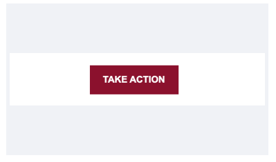
The Button Block contains a hyperlink styled as a button. Its sizing, colors, position, and text can be edited.
Options
| Name | Type | Description |
|---|---|---|
| Background Color | Select | The background color of the block. Choose from predefined options of your brand. |
| Space Top | Text | The spacing above the block. Use a numerical value in pixels |
| Space Bottom | Text | The spacing below the block. Use a numerical value in pixels |
| Button Background Color | Select | The background color of the button. Choose from predefined options of your brand. |
| Button Border Color | Select | The border color of the button. Choose from predefined options of your brand. |
| Text Color | Select | The text color of the button. Choose from predefined options of your brand. |
| Button Label | Text | The text label visible on the button. |
| Button Link | Link | The page that clicking the button will link to. |
| Button Position | Select | The horizontal alignment of the button within the block. Choose from Left, Center, or Right. |
| Button Width | Text | The width of the button. This can be a numerical value (in pixels) or the keyword "auto". Using auto will size the button automatically to fit its text plus any horizontal padding. |
| Button Font Size | Text | The size of the text in the button. Use this to finetune your button style. |
| Button Vertical Padding | Text | The top and bottom padding inside the button (in pixels). Use this to finetune your button style. |
| Button Horizontal Padding | Text | The left and right padding inside the button (in pixels). Use this to finetune your button style. |
Divider Block
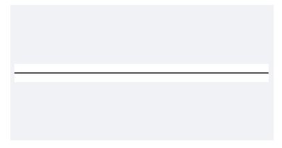
The Divider Block contains a horizontal line used to visually separate sections of your email.
Options
| Name | Type | Description |
|---|---|---|
| Background Color | Select | The background color of the block. Choose from predefined options of your brand. |
| Space Top | Text | The spacing above the block. Use a numerical value in pixels |
| Space Bottom | Text | The spacing below the block. Use a numerical value in pixels |
| Divider Color | Select | The color of the divider line. Choose from predefined options of your brand. |
Footer Block
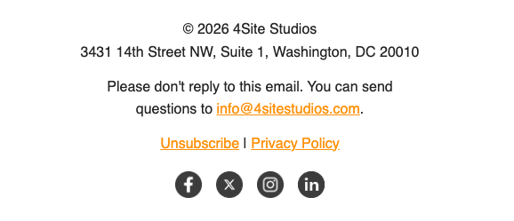
The Footer Block contains a Rich Text Editor, typically used to display your organization's name, address, and other contact information at the bottom of your email.
Options
| Name | Type | Description |
|---|---|---|
| Background Color | Select | The background color of the block. Choose from predefined options of your brand. |
| Space Top | Text | The spacing above the block. Use a numerical value in pixels |
| Space Bottom | Text | The spacing below the block. Use a numerical value in pixels |
| Text | Rich Text editor | Enter and format the footer text for your email, such as your organization's name, address, and contact information. |
Header Logo With Optional Button

The Header Logo With Optional Button block contains a logo image with a hyperlink, along with an optional call-to-action button. It is typically used for the header at the top of your email.
Options
| Name | Type | Description |
|---|---|---|
| Background Color | Select | The background color of the block. Choose from predefined options of your brand. |
| Space Top | Text | The spacing above the block. Use a numerical value in pixels |
| Space Bottom | Text | The spacing below the block. Use a numerical value in pixels |
| Logo | Image URL | The logo image to be displayed. |
| Dark Mode Logo | Image URL | The logo image to be displayed when an email client is using dark mode. If you do not have a specific dark mode logo, you should put the regular logo in here. |
| Logo Width (px) | Text | The width of the logo. A numerical value in pixels. |
| Link URL | Link | The URL that will be opened when the logo is clicked. |
| Logo Alt Text | Text | The text that will be read by screen readers for this logo. |
| Show Button? | Select | Choose whether to display an optional call-to-action button alongside the logo. |
| Button Label | Text | The text label visible on the button. |
| Button Link | Link | The page that clicking the button will link to. |
| Button Background Color | Select | The background color of the button. Choose from predefined options of your brand. |
| Button Border Color | Select | The border color of the button. Choose from predefined options of your brand. |
| Button Text Color | Select | The text color of the button. Choose from predefined options of your brand. |
Logo Header

The Logo Header block contains a single logo image with a hyperlink and an adjustable alignment. It is typically used for the image at the top of your email.
Options
| Name | Type | Description |
|---|---|---|
| Background Color | Select | The background color of the block. Choose from predefined options of your brand. |
| Space Top | Text | The spacing above the block. Use a numerical value in pixels |
| Space Bottom | Text | The spacing below the block. Use a numerical value in pixels |
| Logo | Image URL | The logo image to be displayed. |
| Dark Mode Logo | Image URL | The logo image to be displayed when an email client is using dark mode. If you do not have a specific dark mode logo, you should put the regular logo in here. |
| Logo Width (px) | Text | The width of the logo. A numerical value in pixels. |
| Link URL | Link | The URL that will be opened when the logo is clicked. |
| Logo Alt Text | Text | The text that will be read by screen readers for this logo. |
| Logo Alignment | Select | The horizontal alignment of the logo within the block. Choose from Left, Center, or Right. |
Title Heading
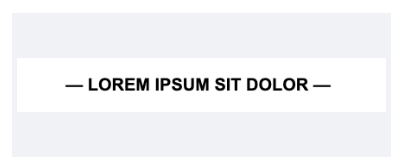
The Title Heading block contains a single line of styled heading text with an optional hyperlink. It is typically used to introduce a new section of your email.
Options
| Name | Type | Description |
|---|---|---|
| Background Color | Select | The background color of the block. Choose from predefined options of your brand. |
| Space Top | Text | The spacing above the block. Use a numerical value in pixels |
| Space Bottom | Text | The spacing below the block. Use a numerical value in pixels |
| Text | Text | The heading text to be displayed. |
| Text Color | Select | The color of the heading text. Choose from predefined options of your brand. |
| Text Size | Text | The font size of the heading text. A numerical value in pixels. |
| Link URL | Link | The URL that will be opened when the heading text is clicked. |
Side-By-Side Image and Text Block
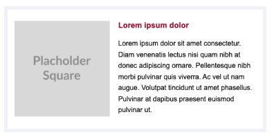
The Side-By-Side Image and Text Block contains an image next to a Rich Text Editor, with an optional text link below the text. The position of the image can be set to either side of the text.
Options
| Name | Type | Description |
|---|---|---|
| Background Color | Select | The background color of the block. Choose from predefined options of your brand. |
| Padding Above | Text | The spacing above the block. Use a numerical value in pixels |
| Padding Below | Text | The spacing below the block. Use a numerical value in pixels |
| Image Position | Select | Whether the image appears to the left or right of the text. Choose from Left or Right. |
| Image | Image URL | The image to be displayed. |
| Image Alt Text | Text | The text that will be read by screen readers for this image. |
| Image Link URL | Link | The URL that will be opened when the image is clicked. |
| Text Content | Rich Text editor | Enter and format the text content that appears alongside the image. |
| Show Text Link? | Select | Choose whether to display an optional text link below the text content. |
| Text Link Label | Text | The text label visible for the text link. |
| Text Link URL | Link | The page that clicking the text link will link to. |
Signature
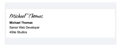
The Signature block contains a signature image alongside a name, position, and organization. It is typically used to close out an email on behalf of a specific sender.
Options
| Name | Type | Description |
|---|---|---|
| Background Color | Select | The background color of the block. Choose from predefined options of your brand. |
| Space Top | Text | The spacing above the block. Use a numerical value in pixels |
| Space Bottom | Text | The spacing below the block. Use a numerical value in pixels |
| Image | Image URL | The signature image to be displayed. |
| Dark Mode Image | Image URL | The signature image to be displayed when an email client is using dark mode. If you do not have a specific dark mode image, you should put the regular image in here. |
| Image Alt Text | Text | The text that will be read by screen readers for this image. |
| Image Width (px) | Text | The width of the image. A numerical value in pixels. |
| Name | Text | The name of the person signing the email. |
| Position | Text | The job title or role of the person signing the email. |
| Organization | Text | The organization the signer belongs to. |
| Text Color | Select | The color of the signature text. Choose from predefined options of your brand. |
Social Media Icons Block
The Social Media Icons Block contains up to eight social media icons, each with its own image, alt text, hyperlink, and visibility toggle. It is typically used to link out to an organization's social media profiles.
Options
| Name | Type | Description |
|---|---|---|
| Background Color | Select | The background color of the block. Choose from predefined options of your brand. |
| Space Top | Text | The spacing above the block. Use a numerical value in pixels |
| Space Bottom | Text | The spacing below the block. Use a numerical value in pixels |
| Icon Spacing (px) | Text | The spacing between each social media icon. Use a numerical value in pixels. |
| Show Icon 1? | Select | Choose whether to display the first social media icon. |
| Icon 1 Image | Image URL | The image to be displayed for the first social media icon. |
| Icon 1 Alt Text | Text | The text that will be read by screen readers for the first icon. |
| Icon 1 Link | Link | The URL that will be opened when the first icon is clicked. |
| Show Icon 2? | Select | Choose whether to display the second social media icon. |
| Icon 2 Image | Image URL | The image to be displayed for the second social media icon. |
| Icon 2 Alt Text | Text | The text that will be read by screen readers for the second icon. |
| Icon 2 Link | Link | The URL that will be opened when the second icon is clicked. |
| Show Icon 3? | Select | Choose whether to display the third social media icon. |
| Icon 3 Image | Image URL | The image to be displayed for the third social media icon. |
| Icon 3 Alt Text | Text | The text that will be read by screen readers for the third icon. |
| Icon 3 Link | Link | The URL that will be opened when the third icon is clicked. |
| Show Icon 4? | Select | Choose whether to display the fourth social media icon. |
| Icon 4 Image | Image URL | The image to be displayed for the fourth social media icon. |
| Icon 4 Alt Text | Text | The text that will be read by screen readers for the fourth icon. |
| Icon 4 Link | Link | The URL that will be opened when the fourth icon is clicked. |
| Show Icon 5? | Select | Choose whether to display the fifth social media icon. |
| Icon 5 Image | Image URL | The image to be displayed for the fifth social media icon. |
| Icon 5 Alt Text | Text | The text that will be read by screen readers for the fifth icon. |
| Icon 5 Link | Link | The URL that will be opened when the fifth icon is clicked. |
| Show Icon 6? | Select | Choose whether to display the sixth social media icon. |
| Icon 6 Image | Image URL | The image to be displayed for the sixth social media icon. |
| Icon 6 Alt Text | Text | The text that will be read by screen readers for the sixth icon. |
| Icon 6 Link | Link | The URL that will be opened when the sixth icon is clicked. |
| Show Icon 7? | Select | Choose whether to display the seventh social media icon. |
| Icon 7 Image | Image URL | The image to be displayed for the seventh social media icon. |
| Icon 7 Alt Text | Text | The text that will be read by screen readers for the seventh icon. |
| Icon 7 Link | Link | The URL that will be opened when the seventh icon is clicked. |
| Show Icon 8? | Select | Choose whether to display the eighth social media icon. |
| Icon 8 Image | Image URL | The image to be displayed for the eighth social media icon. |
| Icon 8 Alt Text | Text | The text that will be read by screen readers for the eighth icon. |
| Icon 8 Link | Link | The URL that will be opened when the eighth icon is clicked. |
Spacer
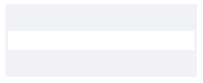
The Spacer block contains a blank area of adjustable height and color. It is typically used to add vertical space between other blocks in your email.
Options
| Name | Type | Description |
|---|---|---|
| Background Color | Select | The background color of the block. Choose from predefined options of your brand. |
| Height (px) | Text | The height of the spacer. Use a numerical value in pixels. |
Rich Text
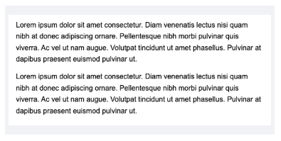
The Rich Text block contains a Rich Text Editor where you can freely add text and style it using Engaging Networks' text editor.
Options
| Name | Type | Description |
|---|---|---|
| Background Color | Select | The background color of the block. Choose from predefined options of your brand. |
| Space Top | Text | The spacing above the block. Use a numerical value in pixels |
| Space Bottom | Text | The spacing below the block. Use a numerical value in pixels |
| Text | Rich Text editor | Enter and format text for your email. |
3 Buttons Block
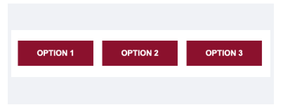
The 3 Buttons Block contains three hyperlinks styled as buttons, arranged side by side. Each button's colors, text, and destination can be edited independently.
Options
| Name | Type | Description |
|---|---|---|
| Background Color | Select | The background color of the block. Choose from predefined options of your brand. |
| Space Top | Text | The spacing above the block. Use a numerical value in pixels |
| Space Bottom | Text | The spacing below the block. Use a numerical value in pixels |
| Left Background Color | Select | The background color of the left button. Choose from predefined options of your brand. |
| Left Border Color | Select | The border color of the left button. Choose from predefined options of your brand. |
| Left Text Color | Select | The text color of the left button. Choose from predefined options of your brand. |
| Left Label | Text | The text label visible on the left button. |
| Left Link | Link | The page that clicking the left button will link to. |
| Center Background Color | Select | The background color of the center button. Choose from predefined options of your brand. |
| Center Border Color | Select | The border color of the center button. Choose from predefined options of your brand. |
| Center Text Color | Select | The text color of the center button. Choose from predefined options of your brand. |
| Center Label | Text | The text label visible on the center button. |
| Center Link | Link | The page that clicking the center button will link to. |
| Right Background Color | Select | The background color of the right button. Choose from predefined options of your brand. |
| Right Border Color | Select | The border color of the right button. Choose from predefined options of your brand. |
| Right Text Color | Select | The text color of the right button. Choose from predefined options of your brand. |
| Right Label | Text | The text label visible on the right button. |
| Right Link | Link | The page that clicking the right button will link to. |
2 Buttons Block
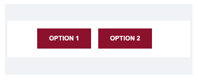
The 2 Buttons Block contains two hyperlinks styled as buttons, arranged side by side. Each button's colors, text, and destination can be edited independently.
Options
| Name | Type | Description |
|---|---|---|
| Background Color | Select | The background color of the block. Choose from predefined options of your brand. |
| Space Top | Text | The spacing above the block. Use a numerical value in pixels |
| Space Bottom | Text | The spacing below the block. Use a numerical value in pixels |
| Buttons Width (px) | Text | The maximum width of each button. A numerical value in pixels. |
| Button Vertical Padding | Text | The top and bottom padding inside each button (in pixels). Use this to finetune your button style. |
| Button Horizontal Padding | Text | The left and right padding inside each button (in pixels). Use this to finetune your button style. |
| Button Font Size | Text | The size of the text in each button. Use this to finetune your button style. |
| Left Background Color | Select | The background color of the left button. Choose from predefined options of your brand. |
| Left Border Color | Select | The border color of the left button. Choose from predefined options of your brand. |
| Left Text Color | Select | The text color of the left button. Choose from predefined options of your brand. |
| Left Label | Text | The text label visible on the left button. |
| Left Link | Link | The page that clicking the left button will link to. |
| Right Background Color | Select | The background color of the right button. Choose from predefined options of your brand. |
| Right Border Color | Select | The border color of the right button. Choose from predefined options of your brand. |
| Right Text Color | Select | The text color of the right button. Choose from predefined options of your brand. |
| Right Label | Text | The text label visible on the right button. |
| Right Link | Link | The page that clicking the right button will link to. |